I Spent 40 Hours Building the Wrong Solution (And Why SVGs Failed Me)
How I built a multi-beverage hydration visualizer for DewDrop — and why the “best” solution wasn’t the right one.
The Problem That Wouldn’t Let Me Sleep
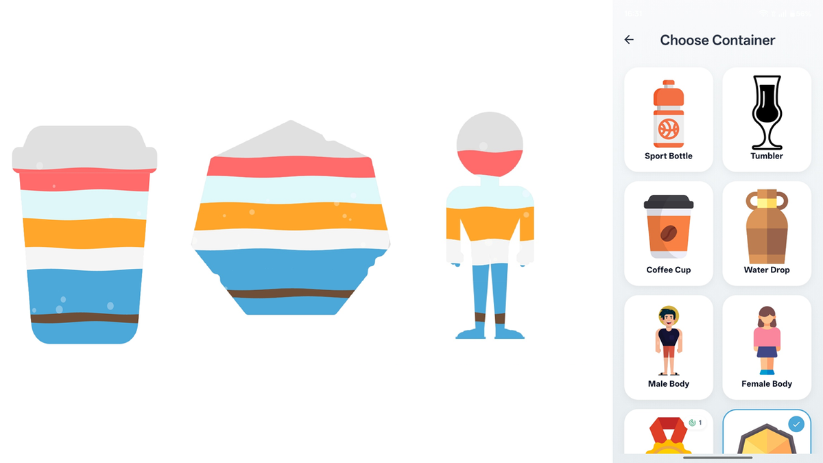
I had a beautiful design mockup for my hydration tracker, DewDrop. On screen: a bottle filling with water as users logged their intake. Simple, elegant, motivating.
Then I added a feature request that changed everything: “What if users drink coffee, tea, and juice throughout the day?”
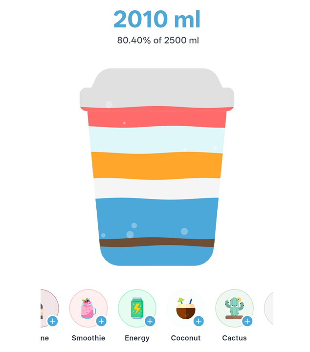
Suddenly, my elegant single-color water fill needed to become a stacked visualization — like a layered cocktail, showing exactly what someone drank and when.
Coffee at 8am (brown), water at 10am (blue), tea at noon (green), all stacked in chronological order within the same bottle shape.
This wasn’t just “add more colors.” This was:
- Render multiple liquids in the same container
- Stack them chronologically (first drink at bottom)
- Make each layer animated with waves
- Ensure waves connect smoothly between layers
- Handle overflow (what if total drinks exceed 100%?)
- Make it performant enough for 60fps animation
Oh, and do it all without making the user feel like they’re using a complex engineering project.
The First Instinct: “Just Draw More Rectangles”
My brain immediately went to the simplest approach: stacked colored rectangles with some blend modes.
I spent about 30 minutes building a proof-of-concept. It worked… sort of. The liquids filled the bottle, but:
- The rectangles filled the ENTIRE width — including the transparent padding around the bottle image
- No shape conformity — liquids in a narrow-neck bottle looked identical to liquids in a wide glass
- Wave animations were a nightmare — each layer needed independent waves that somehow looked connected
Visual representation of the problem:
What I wanted:           What I got:
   ┌─────┐                ┌───────────┐
   │     │                │███████████│ ← Liquid everywhere!
   │     │                │███┌───┐███│
   │  ┌──┤                │███│   │███│
   │  │██│                │███│███│███│
   │  │██│                │███│███│███│
   │  └──┤                │███└───┘███│
   │     │                └───────────┘
   └─────┘
This wasn’t going to work.
The SVG Revolution (That Never Happened)
Then I had what felt like a brilliant insight: SVG paths.
The logic was compelling:
- SVG shapes are mathematical definitions, not pixel-based images
- File sizes: 2–20 KB vs 50–500 KB for PNGs
- Perfect scaling to any screen size
- I could use
canvas.clipPath()to constrain the water fill
I dove deep into the implementation. I read documentation. I studied the path_drawing package. I built prototypes. I even wrote comprehensive architecture documents (which you saw in my uploaded files).
The Theory Was Perfect
The algorithm was elegant:
// Extract the shape boundary from SVG
final shapePath = parseSvgPathData(svgData);

// Calculate water height for each layer
for (var layer in layers) {
  final waterTop = calculateTop(layer.value);

  // Clip to shape, draw water, restore
  canvas.save();
  canvas.clipPath(shapePath);
  canvas.drawRect(waterRect, Paint()..color = layer.color);
  canvas.restore();
}
On paper, this solved everything:
- ✅ Water fills only inside the shape
- ✅ Scales to any size
- ✅ Tiny file sizes
- ✅ Easy for designers to create new shapes
- ✅ Could store shapes as text in database
I was convinced this was the solution.
The Reality Check Hit Hard
Then I tried to actually ship it.
Problem 1: The Asset Hunt
I needed bottle shapes, glass shapes, body silhouettes. As a solo developer working on a personal project, I had three options:
- Pay a designer ($100–500 per shape × 20 shapes = 💸)
- Learn advanced Illustrator/Figma to create professional SVGs myself
- Find free SVG assets online
Option 3 seemed reasonable… until I actually tried it.
Free SVG repositories had:
- Generic bottles (too boring)
- Complex illustrations (too detailed, wouldn’t work as fill containers)
- Licensing nightmares (can’t ship in commercial app)
- Inconsistent quality (some were essentially embedded PNGs, defeating the purpose)
I spent three evenings searching for decent SVG bottle shapes. I found maybe 2 that worked.
Problem 2: The Drawing Complexity
Okay, fine. I’ll draw them myself.
I fired up Figma. Started with a “simple” sport bottle. An hour later, I had… something that looked like a bottle if you squinted.
The problem? Creating SVGs that work as fill containers requires:
- Clean, closed paths (no gaps)
- Proper fill rules (which parts are “inside”?)
- Minimal complexity (too many nodes = laggy animations)
- Aesthetic appeal (can’t just be technically correct)
I’m a developer, not a designer. My bottles looked like they were drawn by a kindergartener with a ruler.
Problem 3: The Diminishing Returns
Let’s say I solved the asset problem. Let’s say I found perfect SVGs or hired a designer.
I’d still need to:
- Parse XML on every shape load
- Convert SVG commands to Flutter Paths
- Handle edge cases (transforms, multiple paths, holes in shapes)
- Debug rendering issues when paths don’t close properly
- Optimize performance (path parsing isn’t free)
And the payoff? File sizes 10x smaller than PNGs.
But modern apps ship with 50MB+ of assets. My PNG shapes would be 200KB each. Even with 50 shapes, that’s 10MB.
Was saving 9MB worth all this complexity?
The honest answer: No.
The Pragmatic Pivot: PNGs
I took a step back. What did I actually need?
- Shapes that look professional
- Easy to create/source
- Work reliably across all devices
- Support my stacked liquid visualization
PNGs check all these boxes. And here’s the kicker:
PNG shape assets are everywhere. Graphic designers create them constantly. Stock sites have thousands. I could commission exactly what I wanted. Or use AI image generators for custom shapes.
The technical challenge remained: how do you fill a PNG shape with stacked liquids?
That’s where the real engineering began.
The “Aha” Moment: Masking
Flutter’s BlendMode.dstIn became my secret weapon.
The concept is beautifully simple:
- Draw your colored layers (all the beverage colors stacked)
- Draw the shape image on top
- Use
BlendMode.dstInto keep ONLY the colored pixels where the shape is opaque
Visual explanation:
Step 1: Draw colored layers Step 2: Mask with shape
┌─────────────────┐    ┌─────────────────┐
│                 │    │                 │
│     (Blue) ████ │    │                 │
│     (Brown)████ │ +  │       ███       │
│     (Orange)███ │    │      ██ ██      │
│                 │    │      █████      │
└─────────────────┘    └─────────────────┘

       ↓ BlendMode.dstIn

    Result: Masked layers
    ┌─────────────────┐
    │                 │
    │                 │
    │      ███ (Blue) │
    │     ██ ██(Brown)│
    │     █████(Ornge)│
    └─────────────────┘
The code is remarkably clean:
// Draw all colored layers
canvas.saveLayer(imageRect, Paint());
for (var layer in layers) {
  final path = createWavePath(layer);
  canvas.drawPath(path, Paint()..color = layer.color);
}
// Mask with shape image
final maskPaint = Paint()..blendMode = BlendMode.dstIn;
canvas.drawImageRect(image, srcRect, imageRect, maskPaint);
canvas.restore();
That’s it. That’s the entire masking logic.
What I Actually Shipped
The final implementation uses:
- PNG shape images (average 150KB each)
- Custom painter with blend mode masking
- Wave generation with proper phase continuity between layers
- Bubble physics simulation
- Clipping to prevent “towers” (liquids extending outside bottle bounds)
I have 28 unique shapes in the app. Total asset size: ~4MB. Which could also be made a lot more by using a cloud datastore for storing file and displaying using API thus saving APK size.
Could I have done it with SVGs? Theoretically, yes. Would it have been better? Absolutely not.
The Lessons (The Ones They Don’t Tell You)
1. “Best Practice” ≠ Best for Your Project
The Flutter community loves SVGs. And they’re right — for icons, for scalable graphics, for multi-resolution assets. But for this specific use case, PNGs were objectively better.
The lesson: Don’t cargo-cult solutions. Evaluate trade-offs for your constraints.
2. Practical Beats Perfect
I could have spent 6 more months:
- Solving the SVG asset pipeline
- Building an in-app shape editor
- Creating a marketplace for user-generated SVG shapes
Instead, I shipped a feature that works beautifully with PNGs. Users love it. Nobody has ever asked, “But why not SVGs?”
3. Solo Dev Constraints Are Real
If I had a designer on retainer, maybe SVGs make sense. If I had a team, maybe the investment pays off.
But I’m one person, building this in evenings and weekends. The 80/20 rule hits hard here: PNG shapes gave me 90% of the benefit for 10% of the complexity.
What’s Next
In Part 2, I’ll dive into the technical implementation:
- The exact algorithm for stacking colored layers
- Wave generation with phase continuity
- Bubble physics
- Blend mode masking in detail
- Handling overflow (drinks exceeding 100% goal)
- Performance optimizations
We’ll look at code, break down the math, and explore why certain architectural decisions made the final implementation both simple and powerful.
The best technical solutions often come from rejecting the “obvious” path and asking: “What would actually work for this problem?”
For DewDrop, that answer was PNGs, blend modes, and a healthy dose of pragmatism.
Coming up in Part 2: The technical deep-dive — stacked layers, wave physics, masking, and the complete rendering pipeline
Thanks for reading! If you’re building something similar, I hope this saves you from the SVG rabbit hole I went down. Sometimes the “boring” solution is the right one.
Follow me for Part 2, where we get into the code.