How to Improve Your Flutter UI Architecture
Whether or not you know them, this article will improve not just your UI architecture but also reduce the coding time that you spend writing boilerplate.
Post by: Yuki Attano
Hello there.
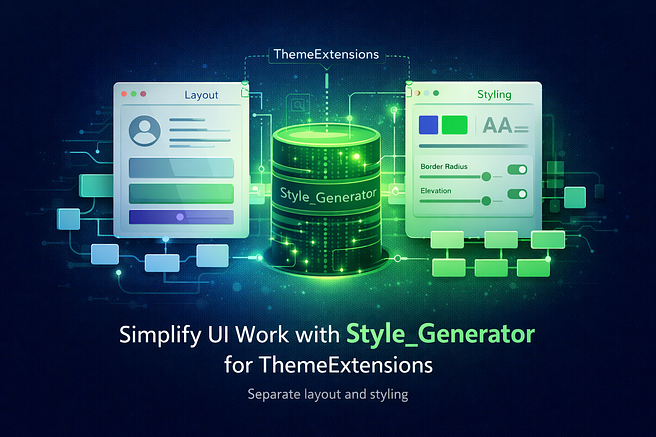
This article will discuss Flutter's ThemeExtensions and how the code generator style_generator on pub.dev will help us maintain them to make edits quickly.
Overview
- Introduction
- What are magic and hardcoded values?
- Why one should avoid magic and hardcoded values
- ThemeExtensions and Style Classes
- ThemeExtension Style generation
- Summary
(If you already know ThemeExtensions, I recommend you jump straight to ‘ThemeExtensions and Style Classes’)
First things first. Let’s take the following example to begin our journey.
You’ve built an achievement board for gamification, and this is how your achievement tiles turned out.

Let's take a brief look at the Code.
(You don’t have to understand it, briefly scan the coding pattern)
    class AchievementCard extends StatelessWidget {
    // ...

    const AchievementCard({
      super.key,
      // ...
    });

    @override
    Widget build(BuildContext context) {
      return Container(
        margin: const EdgeInsets.only(bottom: 12),
        decoration: BoxDecoration(
          color: backgroundColor.withOpacity(0.7),
          borderRadius: BorderRadius.circular(12),
          border: Border.all(...),
          boxShadow: [
            BoxShadow(...),
          ],
        ),
        child: ListTile(
          contentPadding: const EdgeInsets.all(12),
          leading: Container(
            width: 50,
            height: 50,
            decoration: BoxDecoration(
              color: achievement.isUnlocked ? ... : ...,
              borderRadius: ...,
              border: Border.all(...),
            ),
            child: Center(
              child: Text(
                achievement.icon,
                style: TextStyle(...),
              ),
            ),
          ),
          title: Text(
            achievement.name,
            style: TextStyle(...),
          ),
          subtitle: Column(...),
      );
    }
Did you spot bad coding practices? If not, this article will greatly improve your habits.
  class AchievementCard extends StatelessWidget {
    // ...

    const AchievementCard({
      super.key,
      // ...
    });

    @override
    Widget build(BuildContext context) {
      // Magic and hard coded values everywhere
      return Container(
        margin: const EdgeInsets.only(bottom: 12), // here
        decoration: BoxDecoration(

          color: backgroundColor.withOpacity(0.7), // here
          borderRadius: BorderRadius.circular(12), // here
          border: Border.all(...),                 // here
          boxShadow: [
            BoxShadow(...),                        // here
          ],
        ),
        child: ListTile(
          contentPadding: const EdgeInsets.all(12),// here
          leading: Container(
            width: 50,                             // here
            height: 50,                            // here
            decoration: BoxDecoration(
              color: achievement.isUnlocked ? ... : ...,
              borderRadius: ...,                   // here
              border: Border.all(...),             // here
            ),
            child: Center(
              child: Text(
                achievement.icon,
                style: TextStyle(...),             // here
              ),
            ),
          ),
          title: Text(
            achievement.name,
            style: TextStyle(...),                 // here
          ),
          subtitle: Column(...),
        ),
      );
    }
What are magic and hardcoded values?
Magic values: Values that let alone, don’t give a meaning but are essential for your app.
If you type EdgeInsets.all(12) like above, you have a magic value of ‘12’ for your margin. Why did you choose 12? Why didn’t you use 10? Do you always use 12? Does 12 have a meaning? What about 24?
Hardcoded values: Values that are baked into your code with no option to control them afterwards.
All styling parameters above are hardcoded, there is no other option than editing them by hand again when you change your styling.
Why one should avoid magic and hardcoded values
The reasons are simple
- You lose the ability to change your app's styling easily
- Run the risk of creating an inconsistent design
- Make the Widget unusable in other locations
In our example, we took a margin and a border radius of 12. Why? Because it was pleasing to our eyes while developing. On another day, we may have designed other parts with a radius of 16 because we liked that more on that day.
What if we plan to reuse that widget in a Dialog again? All the styles are hardcoded, we have no chance to change the margin to bring the tiles closer together. Maybe the surrounding List or Grid already applies some padding, and in addition to the margin of the tiles, they are now padded too much.
All of this leads to an inconsistent design.
And changing every value by hand to get to a consistent design is tedious and nearly impossible.
How to solve that?
We are pursuing multiple goals:
- Make the Widget reusable again
- Remove the magic from our values
- Remove the hardcoded values
Step One (Preparation): Move all your values to the top of your build method and give them a proper name.
  @override
  Widget build(BuildContext context) {
    const margin = EdgeInsets.only(bottom: 12);
    Color bgColor = backgroundColor.withValues(alpha: 0.7);
    BorderRadius borderRadius = BorderRadius.circular(12);
    Border border = Border.all(...);
    final shadow = [ BoxShadow(...) ],

    EdgeInsets contentPadding = const EdgeInsets.all(12);
    double width = 50;
    double height = 50;
    BoxDecoration decoration = BoxDecoration(
      color: achievement.isUnlocked ? ... : ...,
      borderRadius: ...,
      border: borderRadius,
    );

    TextStyle leadingStyle = TextStyle(...);
    TextStyle titleStyle = TextStyle(...);

    // and so on.

    return Container(
      margin: margin,
      decoration: BoxDecoration(
        color: bgColor,
        borderRadius: borderRadius,
        border: border,
        boxShadow: shadow,
      ),
      child: ListTile(
        contentPadding: contentPadding,
        leading: Container(
          width: width,
          height: height,
          decoration: decoration,
          child: Center(
            child: Text(
              achievement.icon,
              style: leadingStyle,
            ),
          ),
        ),
        title: Text(
          achievement.name,
          style: titleStyle,
        ),
        subtitle: Column(...),
      ),
    );
  }
This simple step gained us multiple advantages:
- Separating styling from layout (separation of concerns)
- Improved readability (no random numbers everywhere)
- Easier and faster styling changes (everything in one place)
- Consistent styling (reusing the same borders and colours)
This quick change was already very beneficial for our architecture, but we haven’t reached any goal yet. They are still magic and hardcoded values, and the Widget is still not reusable.
Step Two (Reusability): From here, there are two ways.
The first one would be to move all styling options into the constructor.
Making them nullable allows us to assign our fallback values if no option was passed at another place.
  class AchievementCard extends StatelessWidget {
    final EdgeInsets? margin;
    final Color? bgColor;
    final BorderRadius? borderRadius;
    final Border? border;
    // ...
    final TextStyle? leadingStyle;
    final TextStyle? titleStyle;

    const AchievementCard({
      super.key,
      this.margin,
      this.bgColor,
      this.borderRadius,
      this.border,
      // ...
      this.leadingStyle,
      this.titleStyle,
    });


    @override
    Widget build(BuildContext context) {
      EdgeInsets? m = margin ?? EdgeInsets.only(bottom: 12);
      Color bg = bgColor ?? backgroundColor.withValues(alpha: 0.7);
      BorderRadius bRadius = borderRadius ?? BorderRadius.circular(12);
      Border b = border ?? Border.all(...);
      // ...

      TextStyle leadStyle = leadingStyle ?? TextStyle(...);
      TextStyle titStyle = titleStyle ?? TextStyle(...);
    }
  }
While we could reuse our Widget now, we’ll have new disadvantages.
- The naming of our local variables gets hard
- Besides any good name, it is easy to confuse the local variable with the class property that was passed by another Widget
But holding on to this way, our next step would be to centralise all fallback values in one giant file like ‘theme.dart’.
  // theme.dart

  EdgeInsets bigMargin = EdgeInsets.only(bottom: 12);
  EdgeInsets margin = EdgeInsets.only(bottom: 10);
  EdgeInsets smallMargin = EdgeInsets.only(bottom: 8);

  double backgroundOpacity = 0.7;
  BorderRadius bigRadius = BorderRadius.circular(12);
  BorderRadius radius = BorderRadius.circular(10);
  BorderRadius smallRadius = BorderRadius.circular(8);
  // ...

  TextStyle leadingStyle = TextStyle(...);
  TextStyle titleStyle = TextStyle(...);
    // import with prefix to avoid name conflicts
  import 'theme.dart' as t;

  class AchievementCard extends StatelessWidget {

    final EdgeInsets? margin;
    final Color? bgColor;
    final BorderRadius? borderRadius;
    final Border? border;
    // ...
    final TextStyle? leadingStyle;
    final TextStyle? titleStyle;

    const AchievementCard({
      // ...
    });

    @override
    Widget build(BuildContext context) {
      // use fallbacks derived from theme.dart
      EdgeInsets? m = margin ?? t.bigMargin;
      Color bg = bgColor ?? backgroundColor.withValues(alpha: t.backgroundOpacity);
      BorderRadius bRadius = borderRadius ?? t.bigRadius;
      Border b = border ?? Border.all(...);
      // ...

      TextStyle leadStyle = leadingStyle ?? t.leadingStyle;
      TextStyle titStyle = titleStyle ?? t.titleStyle;
    }
  }
A simple and brilliant way. We removed our magic values and made our hardcoded ones ‘legal’.
Let's go over that:
By giving ‘margin’, ‘radius’, and our text styles names like ‘big…’ and ‘small…, they got meaning.
They let the reader know that we intended to give more space around our Widget here and don’t want to round the corners as much as in other places.
This simple renaming removed the magic.
And by moving the fallback values to one central place, they are easily reusable in all our Widgets.
Therefor they are no longer ‘hardcoded’ in terms of being randomly placed somewhere but now intended as meaningful fallbacks.
Once all our Widgets are using this theme file, we get a consistent style back.
Obviously, once implemented, we quickly notice some major drawbacks.
If all the values are static, we are unable to make use of Materials ThemeData (derived through Theme.of(context)).
But even worse is the inability to reuse our widget in different projects because of the tight coupling to a project-specific file.
Way Two: ThemeExtensions
The linked docs have a good video explanation, but to keep things short: ThemeExtensions not only allow us to separate our styling from our layout, make style variations quickly accessible, and allow seamless animation between dark and light mode (and all other colour variations), but also separate them from our project's structure.
ThemeExtensions and Style Classes
This is the part where even experienced developers can benefit.
ThemeExtensions are style classes, they keep our style properties (those that we already moved to the top of our build method).
In our case, for our previously given Widget, the style class would look like this:
  // AchievementCard

  @override
  Widget build(BuildContext context) {
    const margin = EdgeInsets.only(bottom: 12);
    Color bgColor = backgroundColor.withValues(alpha: 0.7);
    BorderRadius borderRadius = BorderRadius.circular(12);
    Border border = Border.all(...);
    final shadow = [ BoxShadow(...) ],

    EdgeInsets contentPadding = const EdgeInsets.all(12);
    double width = 50;
    double height = 50;
    BoxDecoration decoration = BoxDecoration(
      color: achievement.isUnlocked ? ... : ...,
      borderRadius: ...,
      border: borderRadius,
    );

    TextStyle leadingStyle = TextStyle(...);
    TextStyle titleStyle = TextStyle(...);

    // and so on.

    return Container(
      // ...
    );
  }
  import 'package:flutter/material.dart';

  // 1. inherit ThemeExtension of the same type as your class
  class AchievementCardStyle extends ThemeExtension<AchievementCardStyle>  {
    // 2. everything nullable
    final EdgeInsets? margin;
    final Color? bgColor;
    // ...
    final TextStyle? leadingStyle;
    final TextStyle? titleStyle;

    const AchievementCardStyle({
      this.margin,
      this.bgColor,
      // ...
      this.leadingStyle,
      this.titleStyle,
    });

    // 3. fallback style constructor (optional)
    factory AchievementCardStyle.fallback(BuildContext context) {
      ThemeData theme = Theme.of(context);
      ColorScheme scheme = theme.colorScheme;
      TextTheme textTheme = theme.textTheme;

      return AchievementCardStyle(
        // define all fallback values here
      );
    }

    // 4. copyWith (required by ThemeExtension)
    AchievementCardStyle copyWith({
      EdgeInsets? margin,
      Color? bgColor,
      // ...
      TextStyle? leadingStyle,
      TextStyle? titleStyle,
    }) {
      return AchievementCardStyle(
        margin: margin ?? this.margin,
        bgColor: bgColor ?? this.bgColor,
        // ...
        leadingStyle: leadingStyle ?? this.leadingStyle,
        titleStyle: titleStyle ?? this.titleStyle,
      );
    }

    // 5. merge (optional)
    AchievementCardStyle merge(ThemeExtension<AchievementCardStyle>? other) {
      if (other is! AchievementCardStyle) return this;

      return copyWith(
        margin: other.margin,
        bgColor: other.bgColor,
        // ...
        color: other.color,
        leadingStyle: leadingStyle?.merge(other.leadingStyle) ?? other.leadingStyle,
        titleStyle: titleStyle?.merge(other.titleStyle) ?? other.titleStyle,
      );
    }

    // 6. lerp (required by ThemeExtension)
    AchievementCardStyle lerp(covariant ThemeExtension<AchievementCardStyle>? other, double t) {
      if (other is! AchievementCardStyle) return this;

      return AchievementCardStyle(
        margin: EdgeInsets.lerp(margin, other.margin, t),
        bgColor: Color.lerp(bgColor, other.bgColor, t),
        // ...
        leadingStyle: TextStyle.lerp(leadingStyle, other.leadingStyle, t),
        titleStyle: TextStyle.lerp(titleStyle, other.titleStyle, t),
      );
    }
  }// Suppose this is the place where you add a ThemeData into your MaterialApp.
  // ThemeData allows you to change all sorts of style properties of the Material library.
  // And the 'extensions' property is just for our extension we just wrote.
  var scheme = ColorScheme.fromSeed(...);

  MaterialApp(
    title: appName,
    theme: ThemeData(
      colorScheme: scheme,
      textTheme: // ...
      extensions: <ThemeExtension>[
        // here you can add default parameters
        AchievementCardStyle(
          margin: EdgeInsets.all(12),
          bgColor: scheme.surface.withValues(alpha: 0.7);
          // ...
        ),
      ],
    ),
    home: const MyHomePage(title: appName),
  );
First: We have to inherit from a ThemeExtension to create a new one.
But to understand why we have to write the Class with a type argument of itself, I point you to the docs. Just keep this for now.
Second: I recommend that you keep every field nullable. We will see how to assign default/fallback values shortly.
Third: Explanation follows.
Fourth: A ‘copyWith’ function must be written for our ‘lerp’ function.
Fifth: Explanation follows.
Sixth: The ‘lerp’ function drives our animation power and uses the ‘copyWith’ function to create new instances when (for example) the ThemeData of our app changes.
If you familiarise yourself with ThemeExtensions, you notice that they are a lot of boilerplate. While you only really define the properties that you require for your widget, you also have to add a ‘copyWith’ and ‘lerp’ method.
The latter is required for theme animations caused by changing the ColorScheme or toggling the dark and light modes.
Once you’ve invented your ThemeExtension, you have to apply it to your Widget.
  class AchievementCard extends StatelessWidget {
    // This allows us to modify different properties directly
    final AchievementCardStyle? style;

    const AchievementCardStyle({
      super.key,
      this.style,
    });

  @override
  Widget build(BuildContext context) {

    // Our custom fallback constructor allows us to implement a 'ThemeData'
    // dependent default design (because we pass the current context to it).
    AchievementCardStyle s = AchievementCardStyle.fallback(context);
    // optionally, just call the default constructor.
    // This way, we avoid unnecessary null checks later on.
    // AchievementCardStyle s = AchievementCardStyle();

    // once passed to the 'extensions' parameter of 'ThemeData', we are able to
    // retrieve our global instance from context like this.
    s = s.merge(Theme.of(context).extension<AchievementCardStyle>();

    // 's' now keeps our defaults from our fallback.
    // Than it was overriden by the ones defined in 'ThemeData'.
    // Now we have to also apply our local 'style'.
    s = s.merge(style);

    EdgeInsets margin = s.margin ?? EdgeInsets.zero;
    Color? bgColor = s.bgColor;
    // ...
    TextStyle leadingStyle = s.leadingStyle ?? TextStyle();
    TextStyle titleStyle = s.titleStyle ?? TextStyle();

    // and so on.

    return Container(
      margin: margin,
      decoration: BoxDecoration(
        color: bgColor,
        borderRadius: borderRadius,
        border: border,
        boxShadow: shadow,
      ),
      child: // ...
    );
  }
In the code above, you see the reason for our ‘fallback’ constructor and the ‘merge’ method in the style class.
The ‘fallback’ allows us to avoid null checks on our local variable ‘s’ while also creating a design that has access to all resolved themes at the current point in the Widget tree.
The ‘merge’ simplifies the merging of all design sources heavily.
But why do we have three sources, you may ask.
First: You, as a library creator, have a specific design in mind while creating a Widget. This design is the fallback you always want as a bare minimum to guarantee a pleasant look.
Second: You, as a library user, want to match the design of all third-party libraries with your app's design.
This is where overrides through the ‘ThemeData’ take place.
Third: You always find a reason to locally override the current style. For example, to make variations in just the background colour to make an achievement look shiny after it was achieved.
The advantages of the second way over the first way are manifold.
- No danger in using the wrong style parameter because of names like ‘borderRadius’ vs ‘bRadius’
- Clear Separation of Concerns. The Widget only cares about its layout, while all styling-relevant parameters are outsourced to the style class
- Loose coupling. The Widget can be easily reused in multiple projects or moved into its own package
- Integrated into ThemeData enables seamless animation on theme changes
Right now, you’ve learned how to significantly improve your UI's architecture, but let’s not stop here. The last step will make the cumbersome boilerplate vanish and increase our fun in writing new styles.
For this, I’ve tried a few code generators.
But all of them either lack some important steps in their documentation (how the build.yml can be configured) or generate more than needed, like an equality implementation (‘operator ==’ and ‘hash’).
Some even give bad advice on how ThemeExtensions should be designed and limit the possibilities of using them.
Since I am already using around four code generators in every one of my projects, updating one of them often breaks the others due to their tight dependency constraints on source_gen, build_runner, build and analyzer. Adding another one would make updating my projects even harder.
Another important thing that drove me away from most of them was the bad implementation.
Flutters Material library has a lot of style classes like ‘TextStyle’, ‘BorderRadius’, ‘EdgeInsets’, etc., which do provide a ‘lerp’ method. Yet most of those generators hardcoded these specific classes and require an update if they forgot one, or after a new one is added to the Framework.
Luckily, style_generator brings, besides its low version number (right now 0.2.1), some solid advantages to the table.
- It does not depend on source_gen
- It has a wide range of supported versions of its own dependencies
- It supports a lot of edge cases, like prefixed imports
- It allows simple overrides of lerp and merge methods if required
- It comes with a separate, standalone import of his copy_with method for use in other classes (which already replaced my use of copy_with_extension_gen)
- It has an Android Studio plugin which reduces the writing of boilerplate to nearly nothing.
ThemeExtension Style generation
with style_generator
Our ThemeExtension currently looks like this:
  import 'package:flutter/material.dart';

  class AchievementCardStyle extends ThemeExtension<AchievementCardStyle>  {
    // fields

    const AchievementCardStyle({
      // params
    });

    factory AchievementCardStyle.fallback(BuildContext context) {
      ...
    }

    AchievementCardStyle copyWith({ ... });

    AchievementCardStyle merge(ThemeExtension<AchievementCardStyle>? other);

    AchievementCardStyle lerp(covariant ThemeExtension<AchievementCardStyle>? other, double t);
  }
With our generator and our IDE plugin, after typing ‘styfile’ in an empty file, our class looks like this:
  import 'package:flutter/material.dart';
  // The package import for our annotation
  import 'package:style_generator_annotation/style_generator_annotation.dart';

  // The part of the generated file
  part 'achievement_card_style.style.dart';
  // The annotation
  @Style()                           // and the mixin of the generated file
  class AchievementCardStyle extends ThemeExtension<AchievementCardStyle> with _$AchievementCardStyle {
    // fields
    const AchievementCardStyle({
      // params
    });

    // optional and can be removed if not used
    factory AchievementCardStyle.fallback(BuildContext context) {
      ThemeData theme = Theme.of(context);
      ColorScheme scheme = theme.colorScheme;
      TextTheme textTheme = theme.textTheme;

      return AchievementCardStyle();
    }
    // optional and can be removed. But i'll explain his purpose later on
    factory AchievementCardStyle.of(BuildContext context, [AchievementCardStyle? style]) => _$AchievementCardStyleOf(context, style);
  }
Technically, all we need is to add our fields and the parameters.
As explained above, this generator allows us to use a ‘fallback’ constructor for our own theming (the name can be configured via build.yml and directly via ‘Style’ annotation).
The .of() constructor drives a special reason. If we add him, we are able to reduce the boilerplate in our Widgets, too.
class AchievementCard extends StatelessWidget {
  final AchievementCardStyle? style;

  const AchievementCardStyle({
    super.key,
    this.style,
  });

  @override
  Widget build(BuildContext context) {
    // Before
    AchievementCardStyle s = AchievementCardStyle.fallback(context);
    s = s.merge(Theme.of(context).extension<AchievementCardStyle>();
    s = s.merge(style);
    // After
    AchievementCardStyle s = AchievementCardStyle.of(context, style);
  }
}
It allows us to just care about our styling and write our UI.With this generator, writing ThemeExtensions is a joy.Now, instead of manually merging our styles in the correct order, we just need to call our .of() constructor and pass the optional ‘style’ parameter.
Summary
First, we discussed the advantages of moving our styling parameters to the top of our build method to keep track of them.
Then we learned two ways in ‘how to remove magic and hardcoded styling variables’ to the place where they belong and to separate the concern of our layout (Widget), from our styling properties (external file vs ThemeExtension).
After that, we saw the advantages of a good style generator in how it saves us time (try to write them by hand, you will notice how error-prone the process is).
Lastly, you’ve read this article and only have to take advantage of my shared experience and take your learnings into your project.
Thanks for reading. Feel free to share any thoughts on this in the comment section, and consider sharing my article if it was of help to you :).